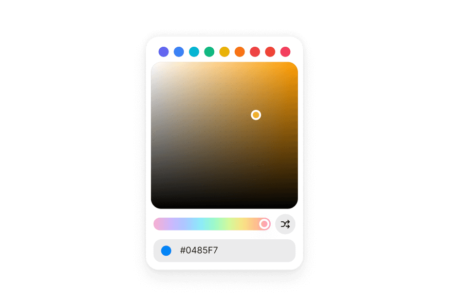
ColorSlider
A color slider allows users to adjust an individual channel of a color value
Usage
import { ColorSlider, Label } from '@heroui/react';Anatomy
import { ColorSlider, Label } from '@heroui/react';

export default () => (
  <ColorSlider channel="hue" defaultValue="hsl(0, 100%, 50%)">
    <Label>Hue</Label>
    <ColorSlider.Output />
    <ColorSlider.Track>
      <ColorSlider.Thumb />
    </ColorSlider.Track>
  </ColorSlider>
)
Examples
Disabled
Vertical
Controlled
HSL Channels
Use multiple ColorSliders to control different channels of a color value. The sliders can share the same color value to create a complete color picker.
Alpha Channel
The alpha channel slider shows a transparency checkerboard pattern to help visualize the transparency level.
RGB Channels
You can also use RGB color space with red, green, and blue channels.
Render Function
Customization
Tailwind CSS
Global CSS
To customize the ColorSlider component classes, you can use the @layer components directive.
Learn more.
@layer components {
  .color-slider {
    @apply flex flex-col gap-2;
  }

  .color-slider__output {
    @apply text-muted text-sm;
  }

  .color-slider__track {
    @apply relative h-5 w-full rounded-full;
  }

  .color-slider__thumb {
    @apply size-4 rounded-full border-3 border-white shadow-overlay;
  }
}
Styling Reference
HeroUI follows the BEM methodology to ensure component variants and states are reusable and easy to customize.
CSS Classes
The ColorSlider component uses these CSS classes (View source styles):
Base Classes
.color-slider- Base slider container.color-slider__output- Output element displaying current value.color-slider__track- Track element with color gradient.color-slider__thumb- Thumb element showing current color
State Classes
.color-slider[data-disabled="true"]- Disabled slider state.color-slider[data-orientation="vertical"]- Vertical orientation.color-slider__thumb[data-dragging="true"]- Thumb being dragged.color-slider__thumb[data-focus-visible="true"]- Thumb keyboard focused.color-slider__thumb[data-disabled="true"]- Disabled thumb state
Interactive States
The component supports both CSS pseudo-classes and data attributes for flexibility:
- Hover:
:hoveror[data-hovered="true"]on thumb - Focus:
:focus-visibleor[data-focus-visible="true"]on thumb - Dragging:
[data-dragging="true"]on thumb - Disabled:
:disabledor[data-disabled="true"]on slider or thumb
API Reference
ColorSlider
Inherits from React Aria ColorSlider.
| Prop | Type | Default | Description |
|---|---|---|---|
channel | ColorChannel | - | The color channel that the slider manipulates (hue, saturation, lightness, brightness, alpha, red, green, blue) |
colorSpace | ColorSpace | - | The color space (hsl, hsb, rgb). Defaults to the color space of the value |
value | string | Color | - | The current color value (controlled) |
defaultValue | string | Color | - | The default color value (uncontrolled) |
onChange | (value: Color) => void | - | Handler called when the value changes during dragging |
onChangeEnd | (value: Color) => void | - | Handler called when dragging ends |
orientation | "horizontal" | "vertical" | "horizontal" | The orientation of the slider |
isDisabled | boolean | - | Whether the slider is disabled |
name | string | - | The name of the input element for form submission |
aria-label | string | - | Accessibility label for the slider |
className | string | - | Additional CSS classes |
children | ReactNode | RenderFunction | - | Slider content or render function |
render | DOMRenderFunction<keyof React.JSX.IntrinsicElements, ColorSliderRenderProps> | - | Overrides the default DOM element with a custom render function. |
ColorSlider.Output
| Prop | Type | Default | Description |
|---|---|---|---|
className | string | - | Additional CSS classes |
children | ReactNode | RenderFunction | - | Output content or render function |
ColorSlider.Track
| Prop | Type | Default | Description |
|---|---|---|---|
className | string | - | Additional CSS classes |
style | CSSProperties | RenderFunction | - | Inline styles or render function |
children | ReactNode | RenderFunction | - | Track content or render function |
ColorSlider.Thumb
| Prop | Type | Default | Description |
|---|---|---|---|
className | string | - | Additional CSS classes |
style | CSSProperties | RenderFunction | - | Inline styles or render function |
children | ReactNode | RenderFunction | - | Thumb content or render function |
Render Props
When using render functions, these values are provided:
| Prop | Type | Description |
|---|---|---|
state | ColorSliderState | The state of the color slider |
color | Color | The current color value |
orientation | "horizontal" | "vertical" | The orientation of the slider |
isDisabled | boolean | Whether the slider is disabled |
Accessibility
The ColorSlider component implements the ARIA slider pattern and provides:
- Full keyboard navigation support (Arrow keys, Home, End, Page Up/Down)
- Screen reader announcements for value changes
- Proper focus management
- Support for disabled states
- HTML form integration via hidden input elements
- Internationalization support with locale-aware value formatting
For more information, see the React Aria ColorSlider documentation.