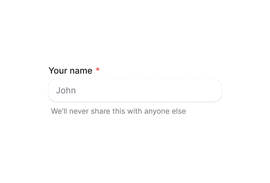
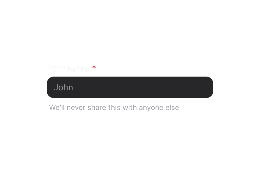
FieldError
Displays validation error messages for form fields
Usage
import { FieldError } from '@heroui/react';The FieldError component displays validation error messages for form fields. It automatically appears when the parent field is marked as invalid and provides smooth opacity transitions.
Examples
Basic Validation
export function Basic() {
  const [value, setValue] = useState("");
  const isInvalid = value.length > 0 && value.length < 3;

  return (
    <TextField className="w-64" isInvalid={isInvalid}>
      <Label htmlFor="username">Username</Label>
      <Input
        id="username"
        placeholder="Enter username"
        value={value}
        onChange={(e) => setValue(e.target.value)}
      />
      <FieldError>Username must be at least 3 characters</FieldError>
    </TextField>
  );
}
With Dynamic Messages
<TextField isInvalid={errors.length > 0}>
  <Label>Password</Label>
  <Input type="password" />
  <FieldError>
    {(validation) => validation.validationErrors.join(', ')}
  </FieldError>
</TextField>
Custom Validation Logic
function EmailField() {
  const [email, setEmail] = useState('');
  const isInvalid = email.length > 0 && !email.includes('@');

  return (
    <TextField isInvalid={isInvalid}>
      <Label>Email</Label>
      <Input
        type="email"
        value={email}
        onChange={(e) => setEmail(e.target.value)}
      />
      <FieldError>Email must include @ symbol</FieldError>
    </TextField>
  );
}
Multiple Error Messages
<TextField isInvalid={hasErrors}>
  <Label>Username</Label>
  <Input />
  <FieldError>
    {errors.map((error, i) => (
      <div key={i}>{error}</div>
    ))}
  </FieldError>
</TextField>
Customization
Tailwind CSS
Global CSS
To customize the FieldError component classes, you can use the @layer components directive. Learn more.
@layer components {
  .field-error {
    @apply font-medium text-danger;
  }
}
Styling Reference
HeroUI follows the BEM methodology to ensure component variants and states are reusable and easy to customize.
CSS Classes
The FieldError component uses these CSS classes (View source styles):
Base Classes
.field-error- Base error styles with danger color- Only shows when the
data-visibleattribute is present - Text is truncated with ellipsis for long messages
API Reference
FieldError
| Prop | Type | Default | Description |
|---|---|---|---|
className | string | - | Additional CSS classes |
children | ReactNode | ((validation: ValidationResult) => ReactNode) | - | Error message content or render function |
Accessibility
The FieldError component ensures accessibility by:
- Using proper ARIA attributes for error announcement
- Supporting screen readers with semantic HTML
- Providing visual and programmatic error indication
- Automatically managing visibility based on validation state