Label
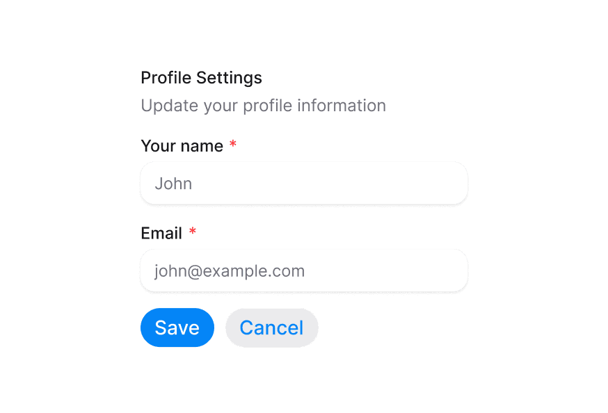
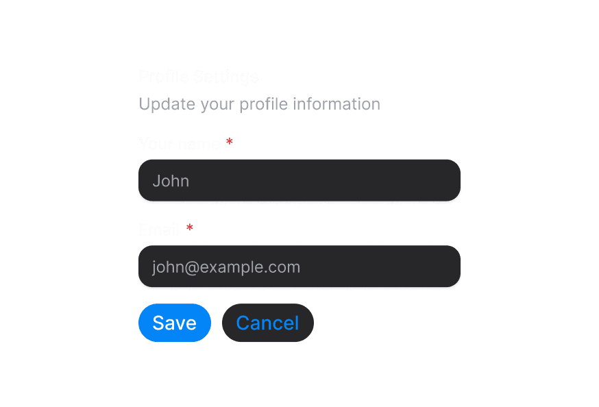
Renders an accessible label associated with form controls
Usage
import { Label } from '@heroui/react';Examples
With Required Indicator
<Label htmlFor="email" isRequired>
  Email Address
</Label>
<Input id="email" type="email" />
With Disabled State
<Label htmlFor="username" isDisabled>
  Username
</Label>
<Input id="username" isDisabled />
With Invalid State
<Label htmlFor="password" isInvalid>
  Password
</Label>
<Input id="password" isInvalid />
Customization
Tailwind CSS
Global CSS
To customize the Label component classes, you can use the @layer components directive. Learn more.
@layer components {
  .label {
    @apply font-semibold text-foreground;
  }

  .label--required::after {
    @apply text-accent;
  }
}
Styling Reference
HeroUI follows the BEM methodology to ensure component variants and states are reusable and easy to customize.
CSS Classes
The Label component uses these CSS classes (View source styles):
Base Classes
.label- Base label styles with text styling
State Modifier Classes
.label--requiredor[data-required="true"] > .label- Shows required asterisk indicator.label--disabledor[data-disabled="true"] .label- Disabled state styling.label--invalidor[data-invalid="true"] .labelor[aria-invalid="true"] .label- Invalid state styling (danger/red text color)
Note: The required asterisk is smartly applied using role and data-slot detection. It excludes:
- Elements with
role="group",role="radiogroup", orrole="checkboxgroup" - Elements with
data-slot="radio"ordata-slot="checkbox"
This prevents duplicate asterisks when using group components with required fields.
API Reference
Label
| Prop | Type | Default | Description |
|---|---|---|---|
htmlFor | string | - | The id of the element the label is associated with |
isRequired | boolean | false | Whether to display a required indicator |
isDisabled | boolean | false | Whether the label is in a disabled state |
isInvalid | boolean | false | Whether the label is in an invalid state |
className | string | - | Additional CSS classes |
children | ReactNode | - | The content of the label |
Accessibility
The Label component is built on the native HTML <label> element (MDN Reference) and follows WAI-ARIA best practices:
- Associates with form controls using the
htmlForattribute - Provides semantic HTML
<label>element - Supports keyboard navigation when associated with form controls
- Communicates required and invalid states to screen readers
- Clicking the label focuses/activates the associated form control