Toolbar
A container for interactive controls with arrow key navigation.
Usage
import { Toolbar } from '@heroui/react';Examples
Vertical
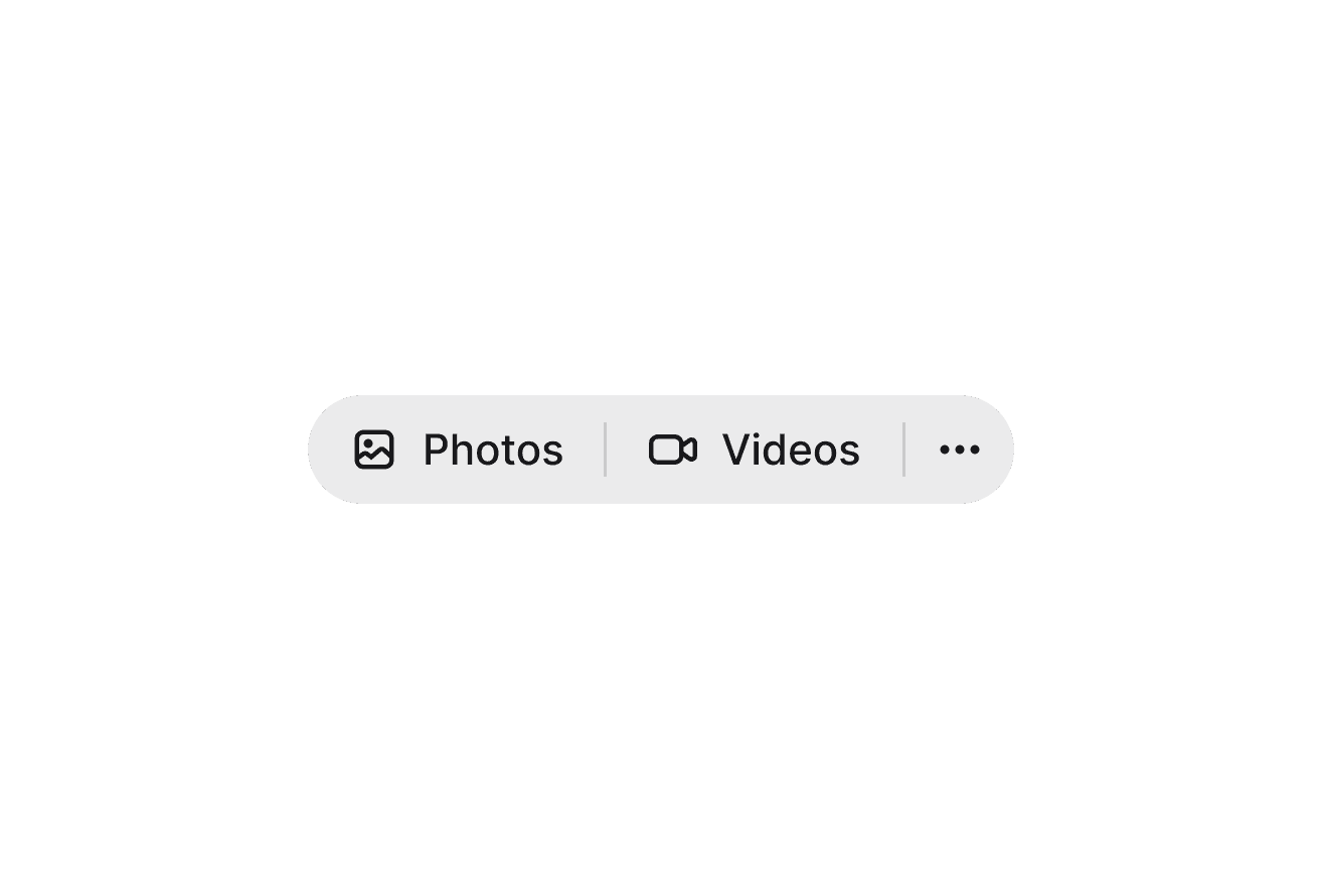
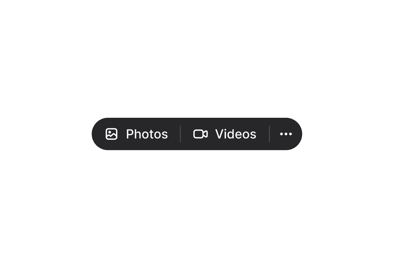
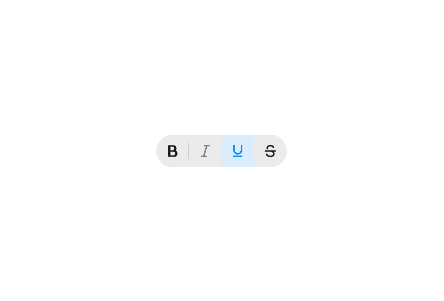
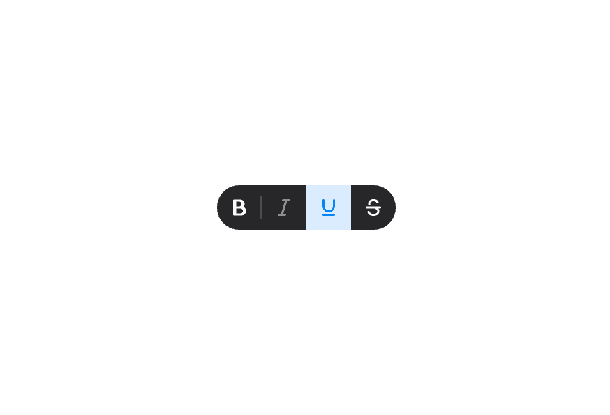
Attached
With ButtonGroup
Customization
Tailwind CSS
Global CSS
To customize the Toolbar component classes, you can use the @layer components directive.
Learn more.
@layer components {
  .toolbar {
    @apply gap-4 rounded-lg bg-surface p-3;
  }
}
Styling Reference
HeroUI follows the BEM methodology to ensure component variants and states are reusable and easy to customize.
CSS Classes
The Toolbar component uses these CSS classes (View source styles):
.toolbar- Base container.toolbar--horizontal- Horizontal orientation (default).toolbar--vertical- Vertical orientation.toolbar--attached- Attached variant with surface background and full rounding
API Reference
Toolbar
Inherits from React Aria Toolbar.
| Prop | Type | Default | Description |
|---|---|---|---|
isAttached | boolean | false | Whether the toolbar has a surface background with full rounding |
orientation | "horizontal" | "vertical" | "horizontal" | The orientation of the toolbar |
aria-label | string | - | An accessible label for the toolbar |
aria-labelledby | string | - | The id of an element that labels the toolbar |
children | React.ReactNode | (values: ToolbarRenderProps) => React.ReactNode | - | Content or render prop |
className | string | (values: ToolbarRenderProps) => string | - | Additional CSS classes |
Render Props
When using the render prop pattern, these values are provided:
| Prop | Type | Description |
|---|---|---|
orientation | "horizontal" | "vertical" | The current orientation of the toolbar |