


v3.1.0
Chinese React docs, accessible soft foreground tokens, shared scrollbar styling, useTheme SSR fixes, Toast cleanup, Link underline updates, and RTL layout refinements.
Minor release: HeroUI React docs now ship with Chinese pages and localized demos, soft color tokens were expanded for better readability, scroll containers share a single themeable scrollbar system, and several runtime and layout fixes landed for useTheme, Toast, Link, Fieldset, overlays, and RTL layouts.
Installation
Update to the latest version:
npm i @heroui/styles@latest @heroui/react@latestpnpm add @heroui/styles@latest @heroui/react@latestyarn add @heroui/styles@latest @heroui/react@latestbun add @heroui/styles@latest @heroui/react@latestUsing AI assistants? Simply prompt "Hey Cursor, update HeroUI to the latest version" and your AI assistant will automatically compare versions and apply the necessary changes. Learn more about the HeroUI MCP Server.
What's New
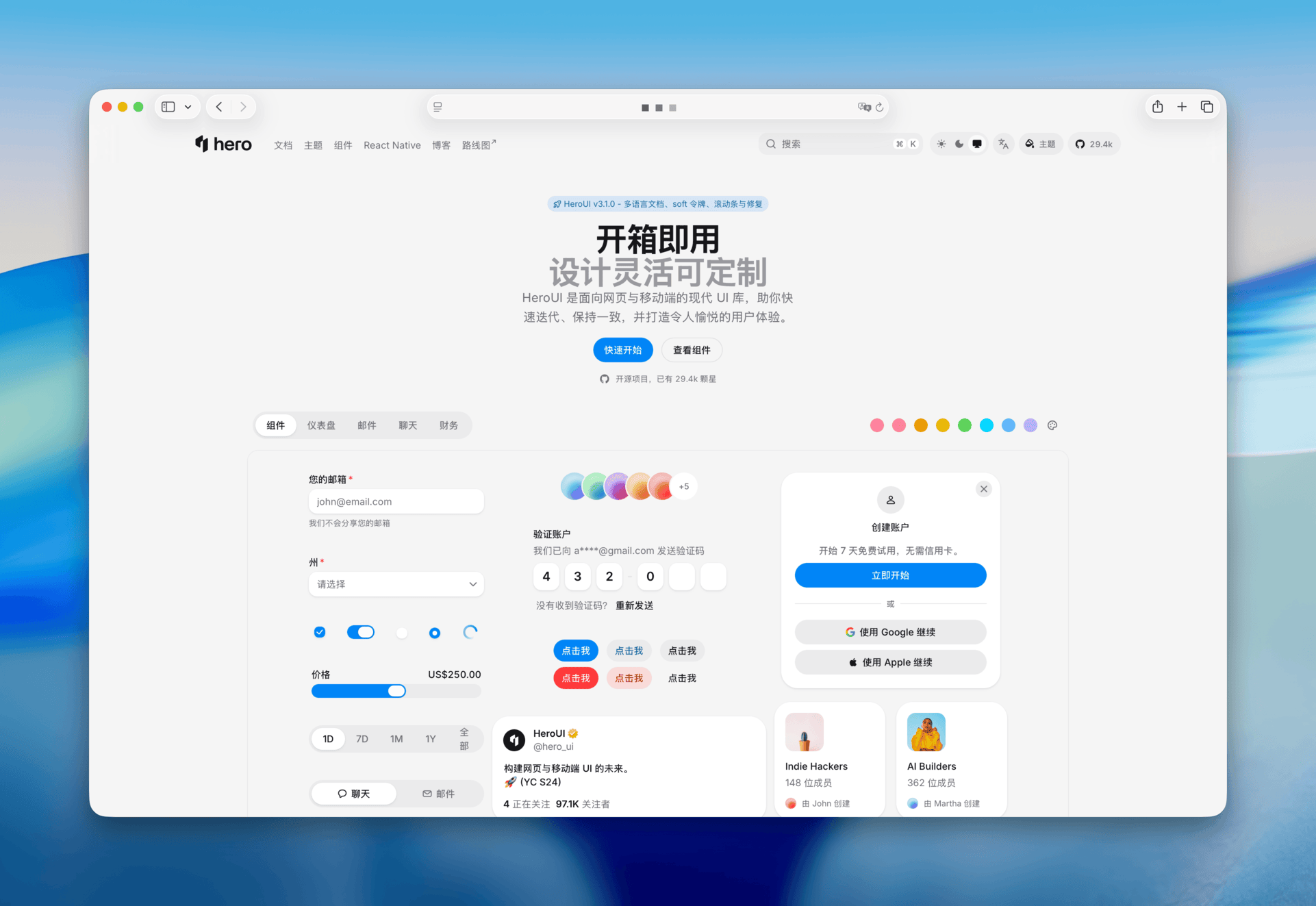
Chinese React Docs
The documentation site now supports localized React docs, migration guides, release notes, and demos in Chinese (#6533). The docs app was restructured around locale-aware content paths and localized demo registries, so React component pages, getting-started guides, and migration references can ship in both English and Chinese.
Accessible Soft Foreground Tokens
Soft foreground colors now use dedicated theme tokens instead of raw semantic colors, improving contrast for soft badges, chips, alerts, toasts, avatars, and calendar range states (#6548).
New tokens include:
--default-soft--default-soft-foreground--default-soft-hover- updated
--accent-soft-foreground,--danger-soft-foreground,--warning-soft-foreground, and--success-soft-foreground
The default palette now uses soft foreground colors with accessibility-compliant contrast. Teams that prefer the previous, more saturated palette can opt into the vibrant palette with data-vibrant-palette="true", but that palette has lower contrast. The theme builder and docs theme selector were updated to preserve this preference.
Shared Scrollbar System
Scroll containers now use a shared, standards-based scrollbar system with theme variables and per-subtree control through data-scrollbar (#6545). Instead of maintaining separate scrollbar CSS in each component, scroll slots now read the same --scrollbar-* variables and use the shared scrollbar utilities, so scroll areas look more consistent across light mode, dark mode, overlays, tables, and custom overflow regions.
Supported modes:
- HeroUI thin: leave
data-scrollbarunset, or setdata-scrollbar="thin"to force the themed thin scrollbar inside a subtree. - Browser default: set
data-scrollbar="default"to use the OS/browser scrollbar. - Hidden: set
data-scrollbar="none"to hide the visible scrollbar while keeping the content scrollable.
<div data-scrollbar="thin">Uses the HeroUI themed scrollbar</div>
<div data-scrollbar="default">Uses the browser scrollbar</div>
<div data-scrollbar="none">Hides descendant HeroUI scrollbars</div>Components such as Select, ComboBox, Autocomplete, Dropdown, DatePicker, DateRangePicker, ColorPicker, Table, Tabs, Modal, Drawer, and ScrollShadow now share the same scrollbar utilities instead of maintaining one-off scrollbar CSS.
Use the scrollbar utility on any scrollable slot that should follow the active data-scrollbar mode. It reads --scrollbar-width, --scrollbar-color, and --scrollbar-gutter, so the same slot can render as HeroUI thin, browser default, or hidden depending on the nearest data-scrollbar ancestor.
.alert-dialog__body {
  @apply min-h-0 flex-1 scrollbar;
}
The theme variables also moved from a single fixed --scrollbar color to a small scrollbar token set:
/* before */
--scrollbar: oklch(70.5% 0.015 286.067);

/* after */
--scrollbar: var(--scrollbar-thumb);
--scrollbar-thumb: color-mix(in oklch, var(--foreground) 15%, transparent);
--scrollbar-track: transparent;
--scrollbar-gutter: auto;
--scrollbar-width: thin;
--scrollbar-color: var(--scrollbar-thumb) var(--scrollbar-track);
--scrollbar now stays as a compatibility alias, while the new thumb, track, gutter, width, and color tokens control the rendered scrollbar.
To return to normal browser scrollbars, set data-scrollbar="default" on the root <html>, your app <main>, or any nested container. The mode cascades through descendant HeroUI scroll slots and custom elements using the scrollbar utilities. If you set the root to browser defaults but want one area to use HeroUI styling again, add data-scrollbar="thin" on that nested element.
<html data-scrollbar="default">
  <main>
    <section data-scrollbar="thin">
      <!-- HeroUI themed scrollbars here -->
    </section>
  </main>
</html>
Component and Runtime Fixes
- Fieldset:
disablednow cascades through descendant field labels and explicitly disables React AriaRadioGroupandSlider, matching native fieldset behavior more closely (#6547). - Toast: non-frontmost toasts are removed from keyboard tab order, and measured toast heights are cleaned up when toasts unmount so long-running sessions do not accumulate stale height entries (#6510, #6512).
useTheme: the hook no longer reads browser-only APIs during SSR, derivesresolvedThemewithout circular state updates, and usesuseSyncExternalStoreto subscribe to system color-scheme changes (#6561).- Link: the default underline is now hidden at rest, appears on hover with a 50% decoration color, and becomes full opacity on active or pressed states. The underline decoration color transition was removed for a crisper interaction (#6570, #6571).
Layout, Overlay, and RTL Fixes
- Overlay positioning: entering overlays now limit transition properties to
opacityandtransform, preventing React Aria placement values from animating and producing incorrect popover placement during open animations (#6549). - Dialog and Modal focus: Modal and AlertDialog content now use clipping that prevents focus from programmatically scrolling the dialog, while body focus rings are no longer cut off by container overflow (#6448, #6557).
- RTL table corners: Table rounded corners now use logical border-radius properties so outer corners remain correct in right-to-left layouts (#6568).
- RTL picker and menu indicators: Select, ListBox.Item, Autocomplete, ComboBox, and MenuItem now use logical inline start/end utilities for chevrons, value text, checkmarks, triggers, and submenu indicators (#6573).
Docs and Dependencies
- Theme docs now match the current
theme.cssandvariables.csstoken model, including soft foreground tokens and scrollbar variables. - Docs release and migration pages were synced with the Link behavior update.
- Docs gained
@fumadocs/languageand upgradedfumadocs-core/fumadocs-uito16.9.0for localized routing. - Tailwind tooling for docs and styles moved to
4.3.0.
Links
Contributors
Thanks to everyone who contributed to this release!