Autocomplete
An autocomplete combines a select with filtering, allowing users to search and select from a list of options
Import
import { Autocomplete, useFilter } from "@heroui/react";Usage
Anatomy
Import the Autocomplete component and access all parts using dot notation.
import {Autocomplete, Label, Description, SearchField, ListBox} from "@heroui/react";

export default () => (
  <Autocomplete>
    <Label />
    <Autocomplete.Trigger>
      <Autocomplete.Value />
      <Autocomplete.ClearButton />
      <Autocomplete.Indicator />
    </Autocomplete.Trigger>
    <Description />
    <Autocomplete.Popover>
      <Autocomplete.Filter>
        <SearchField>
          <SearchField.Group>
            <SearchField.SearchIcon />
            <SearchField.Input />
          </SearchField.Group>
        </SearchField>
        <ListBox>
          <ListBox.Item>
            <Label />
            <ListBox.ItemIndicator />
          </ListBox.Item>
        </ListBox>
      </Autocomplete.Filter>
    </Autocomplete.Popover>
  </Autocomplete>
);
With Description
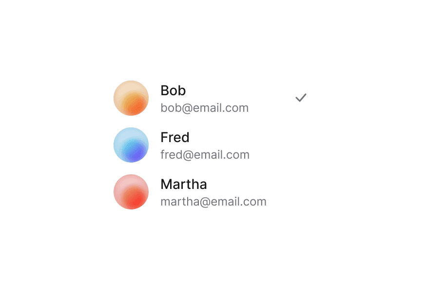
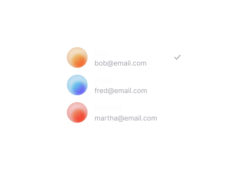
Multiple Select
With Sections
With Disabled Options
Allows Empty Collection
The allowsEmptyCollection prop enables the autocomplete to function even when there are no items in the collection. This is useful for scenarios where the list might be empty initially or when all items are filtered out.
Custom Indicator
Required
Full Width
Variants
The Autocomplete component supports two visual variants:
primary(default) - Standard styling with shadow, suitable for most use casessecondary- Lower emphasis variant without shadow, suitable for use in Surface components
In Surface
When used inside a Surface component, use variant="secondary" to apply the lower emphasis variant suitable for surface backgrounds.
Custom Value
You can customize the displayed value using render props:
Controlled
Controlled Multiple
Controlled Open State
Asynchronous Filtering
Virtualization
Autocomplete supports virtualization through Virtualizer, enabling efficient rendering of large datasets by displaying only the rows visible within the viewport.
Disabled
Advanced Examples
User Selection
User Selection Multiple
Location Search
Tag Group Selection
Email Recipients
Styling
Passing Tailwind CSS classes
import {Autocomplete, SearchField, ListBox} from "@heroui/react";

function CustomAutocomplete() {
  return (
    <Autocomplete className="w-full">
      <Label>State</Label>
      <Autocomplete.Trigger className="rounded-lg border bg-surface p-2">
        <Autocomplete.Value />
        <Autocomplete.ClearButton />
        <Autocomplete.Indicator />
      </Autocomplete.Trigger>
      <Autocomplete.Popover>
        <Autocomplete.Filter>
          <SearchField>
            <SearchField.Group>
              <SearchField.SearchIcon />
              <SearchField.Input placeholder="Search..." />
            </SearchField.Group>
          </SearchField>
          <ListBox>
            <ListBox.Item id="1" textValue="Item 1" className="hover:bg-surface-secondary">
              Item 1
            </ListBox.Item>
          </ListBox>
        </Autocomplete.Filter>
      </Autocomplete.Popover>
    </Autocomplete>
  );
}
Customizing the component classes
To customize the Autocomplete component classes, you can use the @layer components directive.
@layer components {
  .autocomplete {
    @apply flex flex-col gap-1;
  }

  .autocomplete__trigger {
    @apply rounded-lg border border-border bg-surface p-2;
  }

  .autocomplete__value {
    @apply text-current;
  }

  .autocomplete__clear-button {
    @apply text-muted hover:text-foreground;
  }

  .autocomplete__indicator {
    @apply text-muted;
  }

  .autocomplete__popover {
    @apply rounded-lg border border-border bg-surface p-2;
  }

  .autocomplete__popover-dialog {
    @apply outline-none;
  }
}
HeroUI follows the BEM methodology to ensure component variants and states are reusable and easy to customize.
CSS Classes
The Autocomplete component uses these CSS classes (View source styles):
Base Classes
.autocomplete- Base autocomplete container.autocomplete__trigger- The button that triggers the autocomplete.autocomplete__value- The displayed value or placeholder.autocomplete__clear-button- The clear button that removes the selected value.autocomplete__indicator- The dropdown indicator icon.autocomplete__popover- The popover container.autocomplete__popover-dialog- Internal dialog wrapper inside the popover for focus management (matches Popover behavior).autocomplete__filter- The filter wrapper
Variant Classes
.autocomplete--primary- Primary variant with shadow (default).autocomplete--secondary- Secondary variant without shadow, suitable for use in surfaces
State Classes
.autocomplete[data-invalid="true"]- Invalid state.autocomplete__trigger[data-focus-visible="true"]- Focused trigger state.autocomplete__trigger[data-disabled="true"]- Disabled trigger state.autocomplete__value[data-placeholder="true"]- Placeholder state.autocomplete__clear-button[data-empty="true"]- Clear button hidden when no selection.autocomplete__indicator[data-open="true"]- Open indicator state
Interactive States
The component supports both CSS pseudo-classes and data attributes for flexibility:
- Hover:
:hoveror[data-hovered="true"]on trigger - Focus:
:focus-visibleor[data-focus-visible="true"]on trigger - Disabled:
:disabledor[data-disabled="true"]on autocomplete - Open:
[data-open="true"]on indicator
API Reference
Autocomplete Props
| Prop | Type | Default | Description |
|---|---|---|---|
placeholder | string | 'Select an item' | Temporary text that occupies the autocomplete when it is empty |
selectionMode | "single" | "multiple" | "single" | Whether single or multiple selection is enabled |
allowsEmptyCollection | boolean | false | Whether the autocomplete allows an empty collection. When true, the autocomplete can function even with no items. |
isOpen | boolean | - | Sets the open state of the popover (controlled) |
defaultOpen | boolean | - | Sets the default open state of the popover (uncontrolled) |
onOpenChange | (isOpen: boolean) => void | - | Handler called when the open state changes |
disabledKeys | Iterable<Key> | - | Keys of disabled items |
isDisabled | boolean | - | Whether the autocomplete is disabled |
value | Key | Key[] | null | - | Current value (controlled) |
defaultValue | Key | Key[] | null | - | Default value (uncontrolled) |
onChange | (value: Key | Key[] | null) => void | - | Handler called when the value changes |
isRequired | boolean | - | Whether user input is required |
isInvalid | boolean | - | Whether the autocomplete value is invalid |
name | string | - | The name of the input, used when submitting an HTML form |
fullWidth | boolean | false | Whether the autocomplete should take full width of its container |
variant | "primary" | "secondary" | "primary" | Visual variant of the component. primary is the default style with shadow. secondary is a lower emphasis variant without shadow, suitable for use in surfaces. |
className | string | - | Additional CSS classes |
children | ReactNode | RenderFunction | - | Autocomplete content or render function |
Autocomplete.Trigger Props
| Prop | Type | Default | Description |
|---|---|---|---|
className | string | - | Additional CSS classes |
children | ReactNode | RenderFunction | - | Trigger content or render function |
Autocomplete.Value Props
| Prop | Type | Default | Description |
|---|---|---|---|
className | string | - | Additional CSS classes |
children | ReactNode | RenderFunction | - | Value content or render function |
Autocomplete.Indicator Props
| Prop | Type | Default | Description |
|---|---|---|---|
className | string | - | Additional CSS classes |
children | ReactNode | - | Custom indicator content |
Autocomplete.ClearButton Props
| Prop | Type | Default | Description |
|---|---|---|---|
className | string | - | Additional CSS classes |
onClick | (e: MouseEvent) => void | - | Handler called when button is clicked |
ref | RefObject<HTMLButtonElement> | - | Ref to the clear button element |
Autocomplete.Popover Props
| Prop | Type | Default | Description |
|---|---|---|---|
placement | "bottom" | "bottom left" | "bottom right" | "bottom start" | "bottom end" | "top" | "top left" | "top right" | "top start" | "top end" | "left" | "left top" | "left bottom" | "start" | "start top" | "start bottom" | "right" | "right top" | "right bottom" | "end" | "end top" | "end bottom" | "bottom" | Placement of the popover relative to the trigger |
className | string | - | Additional CSS classes |
children | ReactNode | - | Content children. Wrapped internally in a dialog element for focus management, styled with .autocomplete__popover-dialog. |
Autocomplete.Filter Props
| Prop | Type | Default | Description |
|---|---|---|---|
filter | (text: string, input: string) => boolean | - | Custom filter function |
inputValue | string | - | Controlled input value |
onInputChange | (value: string) => void | - | Handler called when input value changes |
children | ReactNode | - | Filter content (SearchField and ListBox) |
useFilter Hook
The useFilter hook from React Aria provides filtering functions for autocomplete functionality.
import {useFilter} from "@heroui/react";

const {contains} = useFilter({sensitivity: "base"});

<Autocomplete.Filter filter={contains}>
  <SearchField>...</SearchField>
  <ListBox>...</ListBox>
</Autocomplete.Filter>
Options:
| Option | Type | Default | Description |
|---|---|---|---|
sensitivity | "base" | "accent" | "case" | "variant" | "base" | Locale sensitivity for matching |
Returns:
| Function | Type | Description |
|---|---|---|
contains | (string: string, substring: string) => boolean | Returns whether a string contains a given substring |
startsWith | (string: string, substring: string) => boolean | Returns whether a string starts with a given substring |
endsWith | (string: string, substring: string) => boolean | Returns whether a string ends with a given substring |
RenderProps
When using render functions with Autocomplete.Value, these values are provided:
| Prop | Type | Description |
|---|---|---|
defaultChildren | ReactNode | The default rendered value |
isPlaceholder | boolean | Whether the value is a placeholder |
state | SelectState | The state of the autocomplete |
selectedItems | Node[] | The currently selected items |
Accessibility
The Autocomplete component implements the ARIA select pattern with filtering and provides:
- Full keyboard navigation support
- Screen reader announcements for selection changes
- Focus management aligned with Popover:
Autocomplete.Popoverwraps its content in an internal dialog so touch interactions do not show a stray focus ring on the popover overlay - Support for disabled states
- Search functionality with filtering
- HTML form integration
Use autoFocus={false} on SearchField when you want to avoid opening the mobile keyboard as soon as the popover appears. Filtering still works once the user focuses the search input.
For more information, see the React Aria Select documentation.