Flexible container component for grouping related content and actions
import { Card } from "@heroui/react" ;
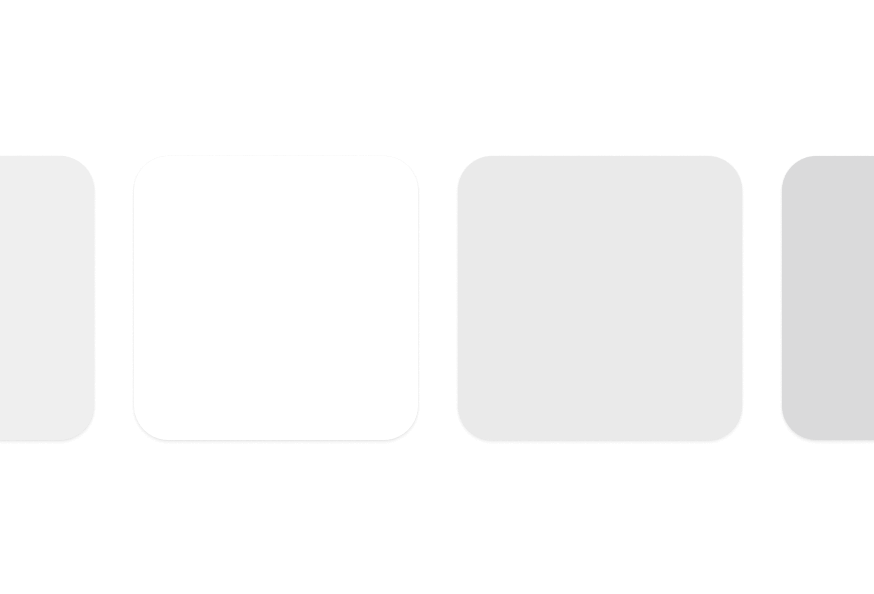
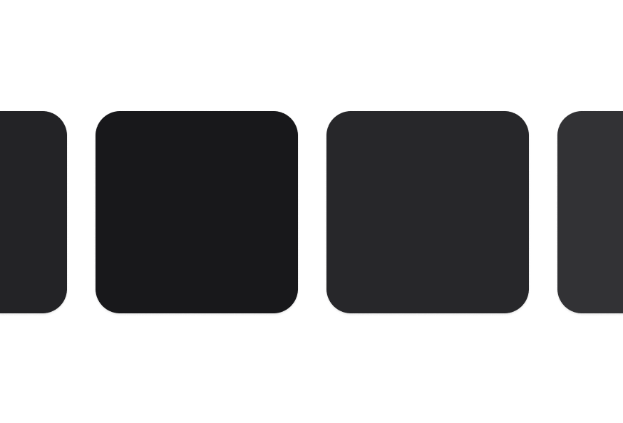
import { Card } from "@heroui/react" ; export default () => ( < Card > < Card.Header > < Card.Title /> < Card.Description /> </ Card.Header > < Card.Content /> < Card.Footer /> </ Card > ); Cards come in semantic variants that describe their prominence level rather than specific visual styles. This allows themes to interpret them differently:
transparentdefaultsecondarytertiary
To customize the Card component classes, you can use the @layer components directive.
Learn more .
@layer components { .card--secondary { @ apply bg-gradient-to-br from-blue- 50 to-purple- 50; } .card__title { @ apply text-xl font-bold ; } } HeroUI follows the BEM methodology to ensure component variants and states are reusable and easy to customize.
Card uses BEM naming for predictable styling (View source styles ):
.card - Base container with padding and border.card__header - Header section container.card__title - Title with base font size and weight.card__description - Muted description text.card__content - Flexible content container.card__footer - Footer with row layout
.card--transparent - Minimal prominence, transparent background (maps to transparent variant).card--default - Standard appearance with surface-secondary (default).card--secondary - Medium prominence with surface-tertiary (maps to secondary variant).card--tertiary - Higher prominence with surface-tertiary (maps to tertiary variant)
Prop Type Default Description variant"transparent" | "default" | "secondary" | "tertiary""default"Semantic variant indicating prominence level classNamestring- Additional CSS classes childrenReact.ReactNode- Card content
Prop Type Default Description classNamestring- Additional CSS classes childrenReact.ReactNode- Header content
Prop Type Default Description classNamestring- Additional CSS classes childrenReact.ReactNode- Title content (renders as h3)
Prop Type Default Description classNamestring- Additional CSS classes childrenReact.ReactNode- Description content (renders as p)
Prop Type Default Description classNamestring- Additional CSS classes childrenReact.ReactNode- Main content
Prop Type Default Description classNamestring- Additional CSS classes childrenReact.ReactNode- Footer content
import { Card } from '@heroui/react' ; import { cardVariants } from '@heroui/styles' ; // Semantic markup < Card role = "article" aria-labelledby = "card-title" > < Card.Header > < Card.Title id = "card-title" >Article Title</ Card.Title > </ Card.Header > </ Card > // Interactive cards < a className = { cardVariants (). base ()} href = "/details" aria-label = "View product details" > < Card.Title >Product Name</ Card.Title > </ a >