Popover
Displays rich content in a portal triggered by a button or any custom element
Import
import { Popover } from '@heroui/react';Usage
Anatomy
Import the Popover component and access all parts using dot notation.
import { Popover } from '@heroui/react';
export default () => (
<Popover>
<Popover.Trigger/>
<Popover.Content>
<Popover.Arrow />
<Popover.Dialog>
<Popover.Heading/>
{/* content goes here */}
</Popover.Dialog>
</Popover.Content>
</Popover>
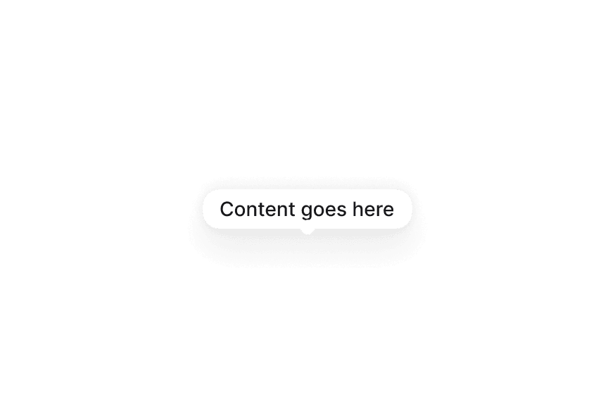
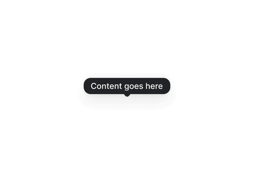
)With Arrow
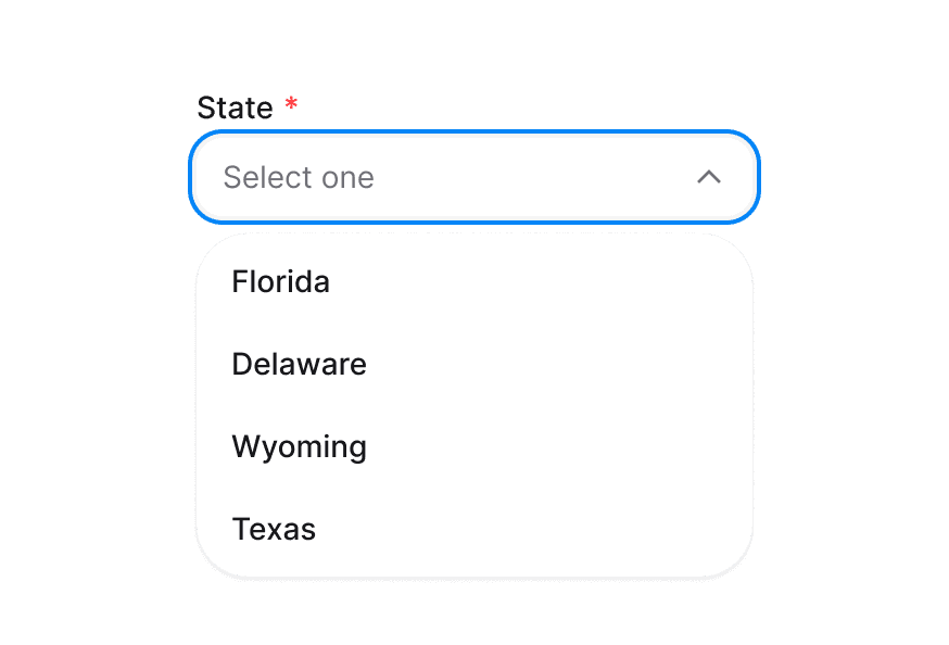
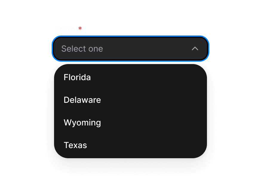
Placement
Interactive Content
Custom Render Function
Styling
Passing Tailwind CSS classes
import { Popover, Button } from '@heroui/react';

function CustomPopover() {
  return (
    <Popover>
      <Popover.Trigger>
        <Button>Open</Button>
      </Popover.Trigger>
      <Popover.Content className="bg-accent text-accent-foreground">
        <Popover.Dialog>
          <h3>Custom Styled</h3>
          <p>This popover has custom styling</p>
        </Popover.Dialog>
      </Popover.Content>
    </Popover>
  );
}
Customizing the component classes
To customize the Popover component classes, you can use the @layer components directive.
Learn more.
@layer components {
  .popover {
    @apply rounded-xl shadow-2xl;
  }

  .popover__dialog {
    @apply p-4;
  }

  .popover__heading {
    @apply text-lg font-bold;
  }
}
HeroUI follows the BEM methodology to ensure component variants and states are reusable and easy to customize.
CSS Classes
The Popover component uses these CSS classes (View source styles):
Base Classes
.popover- Base popover container styles.popover__dialog- Dialog content wrapper.popover__heading- Heading text styles.popover__trigger- Trigger element styles
Interactive States
The component supports animation states:
- Entering:
[data-entering]- Applied during popover appearance - Exiting:
[data-exiting]- Applied during popover disappearance - Placement:
[data-placement="*"]- Applied based on popover position - Focus:
:focus-visibleor[data-focus-visible="true"]
API Reference
Popover Props
| Prop | Type | Default | Description |
|---|---|---|---|
children | React.ReactNode | - | Trigger and content elements |
isOpen | boolean | - | Controls popover visibility (controlled) |
defaultOpen | boolean | false | Initial open state (uncontrolled) |
onOpenChange | (isOpen: boolean) => void | - | Called when open state changes |
Popover.Content Props
| Prop | Type | Default | Description |
|---|---|---|---|
children | React.ReactNode | - | Content to display in the popover |
placement | "top" | "bottom" | "left" | "right" (and variants) | "bottom" | Placement of the popover |
offset | number | 8 | Distance from the trigger element |
shouldFlip | boolean | true | Whether popover can change orientation to fit |
className | string | - | Additional CSS classes |
render | DOMRenderFunction<keyof React.JSX.IntrinsicElements, PopoverRenderProps> | - | Overrides the default DOM element with a custom render function. |
Popover.Dialog Props
| Prop | Type | Default | Description |
|---|---|---|---|
children | React.ReactNode | - | Dialog content |
className | string | - | Additional CSS classes |
Popover.Trigger Props
| Prop | Type | Default | Description |
|---|---|---|---|
children | React.ReactNode | - | Element that triggers the popover |
className | string | - | Additional CSS classes |
Popover.Arrow Props
| Prop | Type | Default | Description |
|---|---|---|---|
children | React.ReactNode | - | Custom arrow element |
className | string | - | Additional CSS classes |
render | DOMRenderFunction<keyof React.JSX.IntrinsicElements, OverlayArrowRenderProps> | - | Overrides the default DOM element with a custom render function. |