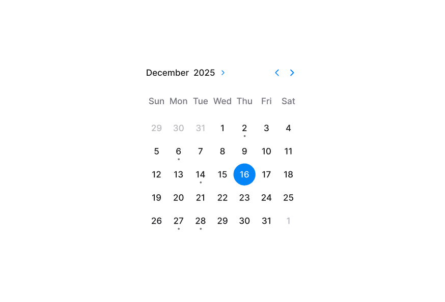
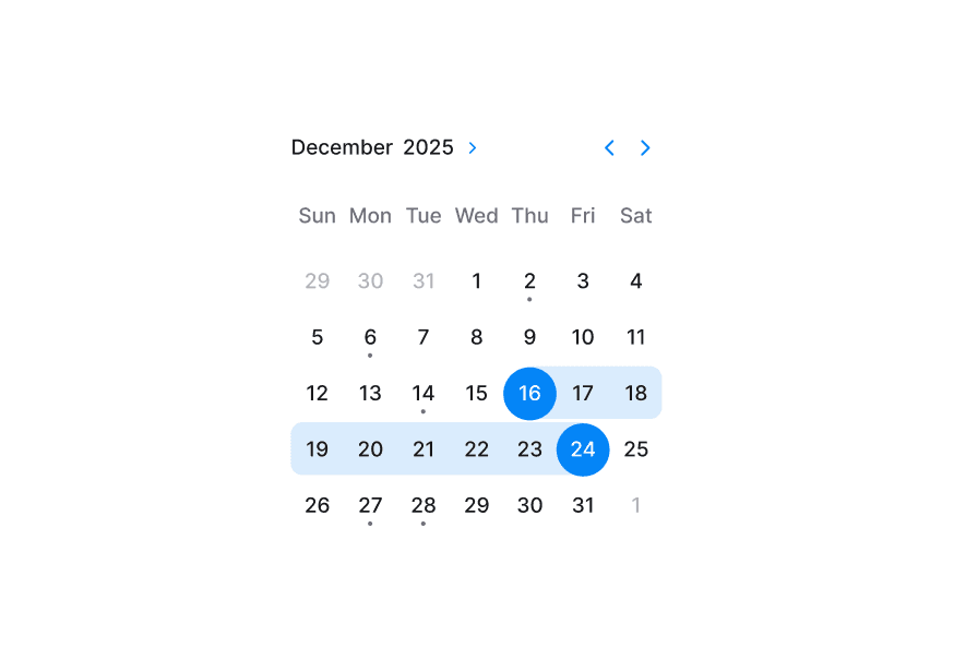
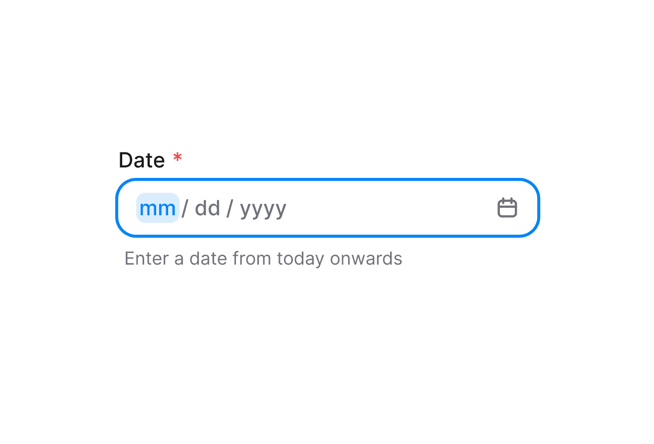
DatePicker
Composable date picker built on React Aria DatePicker with DateField and Calendar composition
Import
import { DatePicker, DateField, Calendar, Label } from '@heroui/react';Usage
Anatomy
DatePicker follows a composition-first API. Compose DateField and Calendar explicitly to control structure and styling.
import {Calendar, DateField, DatePicker, Label} from '@heroui/react';

export default () => (
  <DatePicker>
    <Label />
    <DateField.Group>
      <DateField.Input>
        {(segment) => <DateField.Segment segment={segment} />}
      </DateField.Input>
      <DateField.Suffix>
        <DatePicker.Trigger>
          <DatePicker.TriggerIndicator />
        </DatePicker.Trigger>
      </DateField.Suffix>
    </DateField.Group>
    <DatePicker.Popover>
      <Calendar aria-label="Choose date">
        <Calendar.Header>
          <Calendar.YearPickerTrigger>
            <Calendar.YearPickerTriggerHeading />
            <Calendar.YearPickerTriggerIndicator />
          </Calendar.YearPickerTrigger>
          <Calendar.NavButton slot="previous" />
          <Calendar.NavButton slot="next" />
        </Calendar.Header>
        <Calendar.Grid>
          <Calendar.GridHeader>
            {(day) => <Calendar.HeaderCell>{day}</Calendar.HeaderCell>}
          </Calendar.GridHeader>
          <Calendar.GridBody>{(date) => <Calendar.Cell date={date} />}</Calendar.GridBody>
        </Calendar.Grid>
      </Calendar>
    </DatePicker.Popover>
  </DatePicker>
)
Controlled
Validation
Format Options
Control how DatePicker values are displayed with props such as granularity, hourCycle, hideTimeZone, and shouldForceLeadingZeros.
Disabled
Custom Indicator
DatePicker.TriggerIndicator renders the default IconCalendar when no children are provided. Pass children to replace it.
Form Example
International Calendar
By default, DatePicker displays dates using the calendar system for the user's locale. You can override this by wrapping your DatePicker with I18nProvider and setting the Unicode calendar locale extension.
The example below shows the Indian calendar system:
Note: The onChange event always returns a date in the same calendar system as the value or defaultValue (Gregorian if no value is provided), regardless of the displayed locale. This ensures your application logic works consistently with a single calendar system while still displaying dates in the user's preferred format.
For a complete list of supported calendar systems and their identifiers, see:
Custom Render Function
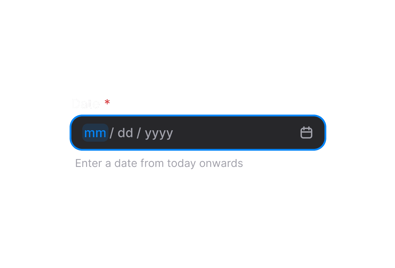
Styling
Passing Tailwind CSS classes
You can style each composition part independently:
import {Calendar, DateField, DatePicker, Label} from '@heroui/react';

function CustomDatePicker() {
  return (
    <DatePicker className="w-[320px] gap-2">
      <Label className="text-sm font-semibold">Date</Label>
      <DateField.Group className="rounded-xl border border-border/60 bg-surface" fullWidth variant="secondary">
        <DateField.Input>
          {(segment) => <DateField.Segment segment={segment} />}
        </DateField.Input>
        <DateField.Suffix>
          <DatePicker.Trigger className="w-full">
            <DatePicker.TriggerIndicator className="text-default-600" />
          </DatePicker.Trigger>
        </DateField.Suffix>
      </DateField.Group>
      <DatePicker.Popover className="rounded-xl p-2">
        <Calendar aria-label="Custom date picker calendar">
          {/* Calendar parts */}
        </Calendar>
      </DatePicker.Popover>
    </DatePicker>
  );
}
Customizing the component classes
To customize DatePicker base classes, use @layer components.
@layer components {
  .date-picker {
    @apply inline-flex flex-col gap-1;
  }

  .date-picker__trigger {
    @apply inline-flex items-center justify-between;
  }

  .date-picker__trigger-indicator {
    @apply text-muted;
  }

  .date-picker__popover {
    @apply min-w-[var(--trigger-width)] p-0;
  }
}
HeroUI follows BEM naming for reusable customization.
CSS Classes
DatePicker uses these classes in packages/styles/components/date-picker.css:
.date-picker- Root wrapper..date-picker__trigger- Trigger part that opens the popover..date-picker__trigger-indicator- Default/custom indicator slot..date-picker__popover- Popover content wrapper.
Interactive States
DatePicker supports React Aria data attributes and pseudo states:
- Open:
[data-open="true"]on trigger. - Disabled:
[data-disabled="true"]or[aria-disabled="true"]on trigger. - Focus visible:
:focus-visibleor[data-focus-visible="true"]on trigger. - Hover:
:hoveror[data-hovered="true"]on trigger.
API Reference
DatePicker Props
DatePicker inherits all props from React Aria DatePicker.
| Prop | Type | Default | Description |
|---|---|---|---|
value | DateValue | null | - | Controlled selected date value. |
defaultValue | DateValue | null | - | Default selected value in uncontrolled mode. |
onChange | (value: DateValue | null) => void | - | Called when selected date changes. |
isOpen | boolean | - | Controlled popover open state. |
defaultOpen | boolean | false | Initial popover open state. |
onOpenChange | (isOpen: boolean) => void | - | Called when popover open state changes. |
isDisabled | boolean | false | Disables date selection and trigger interactions. |
isInvalid | boolean | - | Marks the field as invalid for validation state. |
minValue | DateValue | - | Minimum selectable date. |
maxValue | DateValue | - | Maximum selectable date. |
name | string | - | Name used for HTML form submission. |
children | ReactNode | (values: DatePickerRenderProps) => ReactNode | - | Composed content or render function. |
render | DOMRenderFunction<keyof React.JSX.IntrinsicElements, DatePickerRenderProps> | - | Overrides the default DOM element with a custom render function. |
Composition Parts
| Component | Description |
|---|---|
DatePicker.Root | Root date picker container and state owner. |
DatePicker.Trigger | Trigger button, usually rendered inside DateField.Suffix. |
DatePicker.TriggerIndicator | Indicator slot with default calendar icon. |
DatePicker.Popover | Popover wrapper for Calendar content. |
Related packages
@internationalized/date— date types (CalendarDate,CalendarDateTime,ZonedDateTime) and utilities used by all date componentsI18nProvider— override locale for a subtreeuseLocale— read the current locale and layout direction