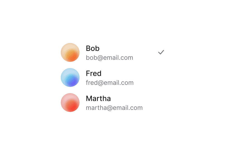
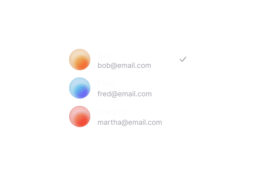
Select
A select displays a collapsible list of options and allows a user to select one of them
Import
import { Select } from "@heroui/react";Usage
Anatomy
Import the Select component and access all parts using dot notation.
import {Select, Label, Description, Header, ListBox, Separator} from "@heroui/react";

export default () => (
  <Select>
    <Label />
    <Select.Trigger>
      <Select.Value />
      <Select.Indicator />
    </Select.Trigger>
    <Description />
    <Select.Popover>
      <ListBox>
        <ListBox.Item>
          <Label />
          <Description />
          <ListBox.ItemIndicator />
        </ListBox.Item>
        <ListBox.Section>
          <Header />
          <ListBox.Item>
            <Label />
          </ListBox.Item>
        </ListBox.Section>
      </ListBox>
    </Select.Popover>
  </Select>
);
With Description
Multiple Select
With Sections
With Disabled Options
Custom Indicator
Required
Full Width
Variants
The Select component supports two visual variants:
primary(default) - Standard styling with shadow, suitable for most use casessecondary- Lower emphasis variant without shadow, suitable for use in Surface components
In Surface
When used inside a Surface component, use variant="secondary" to apply the lower emphasis variant suitable for surface backgrounds.
Custom Value
Controlled
Controlled Multiple
Controlled Open State
Asynchronous Loading
Disabled
Custom Render Function
Styling
Passing Tailwind CSS classes
import {Select} from "@heroui/react";

function CustomSelect() {
  return (
    <Select className="w-full">
      <Label>State</Label>
      <Select.Trigger className="rounded-lg border bg-surface p-2">
        <Select.Value />
        <Select.Indicator />
      </Select.Trigger>
      <Select.Popover>
        <ListBox>
          <ListBox.Item id="1" textValue="Item 1" className="hover:bg-surface-secondary">
            Item 1
          </ListBox.Item>
        </ListBox>
      </Select.Popover>
    </Select>
  );
}
Customizing the component classes
To customize the Select component classes, you can use the @layer components directive.
@layer components {
  .select {
    @apply flex flex-col gap-1;
  }

  .select__trigger {
    @apply rounded-lg border border-border bg-surface p-2;
  }

  .select__value {
    @apply text-current;
  }

  .select__indicator {
    @apply text-muted;
  }

  .select__popover {
    @apply rounded-lg border border-border bg-surface p-2;
  }
}
HeroUI follows the BEM methodology to ensure component variants and states are reusable and easy to customize.
CSS Classes
The Select component uses these CSS classes (View source styles):
Base Classes
.select- Base select container.select__trigger- The button that triggers the select.select__value- The displayed value or placeholder.select__indicator- The dropdown indicator icon.select__popover- The popover container
Variant Classes
.select--primary- Primary variant with shadow (default).select--secondary- Secondary variant without shadow, suitable for use in surfaces
State Classes
.select[data-invalid="true"]- Invalid state.select__trigger[data-focus-visible="true"]- Focused trigger state.select__trigger[data-disabled="true"]- Disabled trigger state.select__value[data-placeholder="true"]- Placeholder state.select__indicator[data-open="true"]- Open indicator state
Interactive States
The component supports both CSS pseudo-classes and data attributes for flexibility:
- Hover:
:hoveror[data-hovered="true"]on trigger - Focus:
:focus-visibleor[data-focus-visible="true"]on trigger - Disabled:
:disabledor[data-disabled="true"]on select - Open:
[data-open="true"]on indicator
API Reference
Select Props
| Prop | Type | Default | Description |
|---|---|---|---|
placeholder | string | 'Select an item' | Temporary text that occupies the select when it is empty |
selectionMode | "single" | "multiple" | "single" | Whether single or multiple selection is enabled |
isOpen | boolean | - | Sets the open state of the menu (controlled) |
defaultOpen | boolean | - | Sets the default open state of the menu (uncontrolled) |
onOpenChange | (isOpen: boolean) => void | - | Handler called when the open state changes |
disabledKeys | Iterable<Key> | - | Keys of disabled items |
isDisabled | boolean | - | Whether the select is disabled |
value | Key | Key[] | null | - | Current value (controlled) |
defaultValue | Key | Key[] | null | - | Default value (uncontrolled) |
onChange | (value: Key | Key[] | null) => void | - | Handler called when the value changes |
isRequired | boolean | - | Whether user input is required |
isInvalid | boolean | - | Whether the select value is invalid |
name | string | - | The name of the input, used when submitting an HTML form |
autoComplete | string | - | Describes the type of autocomplete functionality |
fullWidth | boolean | false | Whether the select should take full width of its container |
variant | "primary" | "secondary" | "primary" | Visual variant of the component. primary is the default style with shadow. secondary is a lower emphasis variant without shadow, suitable for use in surfaces. |
className | string | - | Additional CSS classes |
children | ReactNode | RenderFunction | - | Select content or render function |
render | DOMRenderFunction<keyof React.JSX.IntrinsicElements, SelectRenderProps> | - | Overrides the default DOM element with a custom render function. |
Select.Trigger Props
| Prop | Type | Default | Description |
|---|---|---|---|
className | string | - | Additional CSS classes |
children | ReactNode | RenderFunction | - | Trigger content or render function |
Select.Value Props
| Prop | Type | Default | Description |
|---|---|---|---|
className | string | - | Additional CSS classes |
children | ReactNode | RenderFunction | - | Value content or render function |
render | DOMRenderFunction<keyof React.JSX.IntrinsicElements, SelectValueRenderProps> | - | Overrides the default DOM element with a custom render function. |
Select.Indicator Props
| Prop | Type | Default | Description |
|---|---|---|---|
className | string | - | Additional CSS classes |
children | ReactNode | - | Custom indicator content |
Select.Popover Props
| Prop | Type | Default | Description |
|---|---|---|---|
placement | "bottom" | "bottom left" | "bottom right" | "bottom start" | "bottom end" | "top" | "top left" | "top right" | "top start" | "top end" | "left" | "left top" | "left bottom" | "start" | "start top" | "start bottom" | "right" | "right top" | "right bottom" | "end" | "end top" | "end bottom" | "bottom" | Placement of the popover relative to the trigger |
className | string | - | Additional CSS classes |
children | ReactNode | - | Content children |
RenderProps
When using render functions with Select.Value, these values are provided:
| Prop | Type | Description |
|---|---|---|
defaultChildren | ReactNode | The default rendered value |
isPlaceholder | boolean | Whether the value is a placeholder |
state | SelectState | The state of the select |
selectedItems | Node[] | The currently selected items |
Accessibility
The Select component implements the ARIA listbox pattern and provides:
- Full keyboard navigation support
- Screen reader announcements for selection changes
- Proper focus management
- Support for disabled states
- Typeahead search functionality
- HTML form integration
For more information, see the React Aria Select documentation.